From club member Anne Ramus:
WCC President Paul Spence’s “The Country Shed” is archetypal Australiana: an iconic galvanised iron shed, rusting and slowly crumbling back into the landscape to become part of the eucalypts and dry grasses. The warm, bright light is the “Mediterranean” type so loved by painters and first captured by the Australian Impressionists. You can compare Australia’s first Colonial artists who couldn’t quite let go of the English light or its classic tree-shapes.
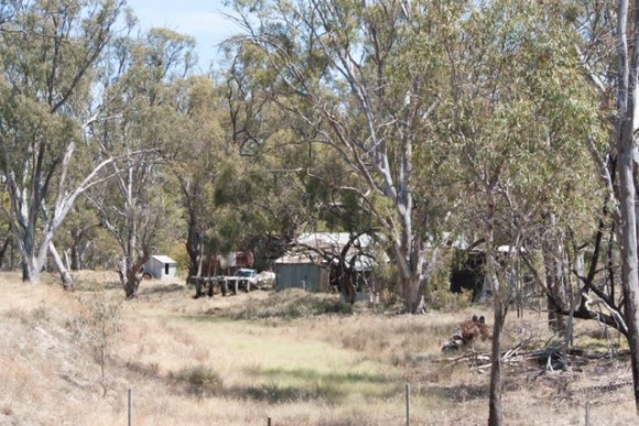
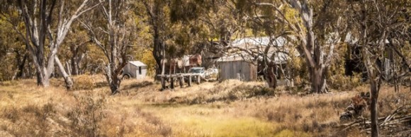
Here are two shots: one is my untouched original – the other is the re-worked image using Lightroom. Paul suggested it might be helpful to others to share what I’d done to “re-invent” it.
When I first saw Paul’s image, I remembered a trip to a bush property some time back, new DSLR in hand. I’d wanted to capture what I saw and how I felt at the time but I didn’t come close: the bones were there, but the flesh of feeling was missing; the light quality and warmth of colours were absent.
I decided to take the image and practise with Lightroom’s tools to re-create what I’d seen at the time and, more importantly, what I’d felt – the human elements overpowered by the Australian landscape, the quality of light, hot and golden.
Here is roughly my workflow as I remember it – but I typically hop backwards and forwards between the tools, not in a strict order:
- Composition – I wanted it to have a panoramic look (like Paul’s) because I felt it suited the subject. I cut out what didn’t contribute – the sky and tops of the eucalypts, a lot of foreground – to give it a breadth of view and a more settled and grounded feeling.
- The buildings and equipment – iconic “human” elements – provided an anchor for the eye, placed to feel comfortable compositionally. While still visible and important focally, they had to remain overpowered by the landscape.
- The colours needed to be warmer and more vivid – as they were at the time – so I moved the Temp slider to the right till it looked okay.
- The sharpness needed help, giving the scene the crispness and brightness demanded by an Australian bush scene – which has none of the dim softness and moisture of an English countryside, for example.
- Adjustment of Highlights and Shadows included the fairly “standard” (for me) of sliding Highlights full down, Shadows full up – to release the details in each.
- I set the White Balance with the Masking slider for darks and lights – shift to right for the lights (till the first speckles appear) and the reverse for the darks, moving the slider to the left. This will set a good tonal range. Overall Exposure might need adjusting here – either up or down.
- I moved the Vibrance slider up to bring out the less saturated colours and give more power to the colours. The Saturation slider can give extra oomph to colours too – if you overdo this (as for any of the sliders), it’s easy to pull back on it.
- I used the Brush tool to choose where I wanted more exposure, then New to choose to darken some areas. Dodging and Burning selectively in this way will give the image more depth and complexity. The Vibrance slider gives mid-tones some punch, but it can be easy to overdo. Cutting back on Saturation to compensate can be beneficial.
- I sharpened the image using the Sharpen slider, with Masking to select which areas I wanted particularly sharp, leaving the rest untouched. Using the Contrast slider can pump up an image too, but you might need to lighten the blacks a little.
- The image needed more warmth, so the Temp slider pushed in more of a golden glow. I didn’t need the Tint slider, but sometimes just a tiny touch can help an image. Again, try it – easy to slide it up or down to taste.
- Even if you’ve gone to the max with Sharpening, you can get even more – use the Brush tool and choose clarity and/or sharpening, and swipe over the areas you want super-sharp (called Sharpness Stacking).
- I introduced only a little Luminance to cut back on noise (including adjusting the Colour Noise slider). Be aware of a guideline of “Sharpening plus Luminance values equal 100”).
- Using the Brush tool, I ran extra sharpness, saturation and exposure adjustment over the buildings and equipment, to give them more presence. (Check too, for Colour aberrations like fringing and purple or green lines around subjects which are also easily eradicated in LR.)
In hindsight, I should have used a tripod but I didn’t own one at the time. A longer shutter speed to achieve sharp focus throughout the scene would have been much better (and thanks to John Mallett for guiding me towards much crisper images and the qualities of light!)
Post-processing is all experimental – you can jump backwards and forwards in using the list of tools, according to the results achieved with each. Some adjustments in LR can be done as “Auto” but I find it’s usually better to do my own. Like using herbs and spices, you have to taste and try all along the way, to get the best result for your image and to gradually develop your own personal workflow – your own recipe. While guidelines can be helpful, post-processing can never be prescriptive: it is simply creativity in action.
While not a particularly good image, my second one is a lot better than my original untouched and discarded one. Digging out that old photo, finding a more suitable composition within it, thinking about the quality of light needed, its focal points and messages, has been good practice – and again I learned the lesson to be less rugged when purging old photos.
It’s good to look in your archives for images that will benefit by some “painting with pixels”, as you’ll now be armed with better editing skills. There was a good reason why you took that shot in the first place, so give it a run!
Anne Ramus
January 2015


