Sharpening images is a basic skill, but often done badly. Too little sharpening and your image will look soft or fuzzy, too much and sharpening artefacts such as halos around detail and edges are prominent. So here are a few notes to assist in understanding what the various sliders in Lightroom’s sharpen tool do.
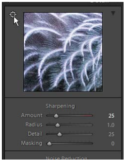
 In the Develop module, the sharpening tool has 4 sliders, Amount, Radius, Detail, Masking. Feel free to play with these and investigate the effects on the image. The “square-cross-hair” icon at the top left of the preview area can be clicked to then click on a relevant area of your image to centre the preview on that area. Or, you can move your cursor over the preview image and note that the cursor becomes a hand. Click and drag to reposition the preview of the image. Choose an area of the image where there is some detail that you are interested in being sharpened. It may be, for example, eyes, or, in this example, some feathers with lots of detail. You can see in this image (right) that there the feathers are a little fuzzy. This preview has the default settings of 25 sharpening, 1.0 radius, 25 detail and 0 masking. Some sharpening is normally expected because of the complex procedures needed to translate the pixels in raw images – in the sensor the different colour pixels are different positions and need to be combined – to a rectangular grid of pixels, each with RGB values (for a brief overview try Demosaicing – Wikipedia if you are interested in the technical details).
 Sharpening is achieved by increasing the local contrast of the image at edges – in essence, the darker side of the edge is made even darker, and the lighter side of the edge is made lighter. This effect is only immediately around the edge, and generates a sense of crispness. This is illustrated left (from Unsharp masking – Wikipedia where you can read more about the process).
Amount. This is fairly straight-forward. Increase this to increase the effect. If Sharpening is set to 0 then the other sliders are greyed out and inactive. If you hold down ALT
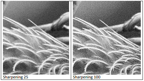
(in windows or OPTION on a Mac) and move the sharpening slider with your mouse, you will note the image becomes monochrome (sharpening works on the luminance not the colour) and the varying sharpening effect is shown as you move the slider. It is best to do this at 100% view (1:1) so you can see the detail clearly. In the screen grabs below note the change with increasing sharpening from 25 to 100 (both with radius 1.0 detail 25 masking 0)

Radius. This reflects the distance (in pixels) that the sharpening effect extends from a sharp edge. Increase the radius too much and halos may become visible (as on the example image above). Lightroom gives you a range of 0.5 to 3.0 pixels, with a default of 1.0. You probably don’t want a radius much over 1.5 unless you are sharpening a very high resolution image that will be viewed at a small size (so halos at 3 pixels are not noticeable). Hold down ALT (or OPTION) and move the radius slider to see the effect. In this case you see the overlay that generates the contrast, so you can clearly see the effect of change in radius is to increase the range and depth of the contrast generated at edges.

Detail. This slider adjusts the amount of sharpening of fine detail. Increasing the slider will increase the contrast (apparent sharpness) around smaller and smaller features. If you increase this too much it will also emphasise grain.
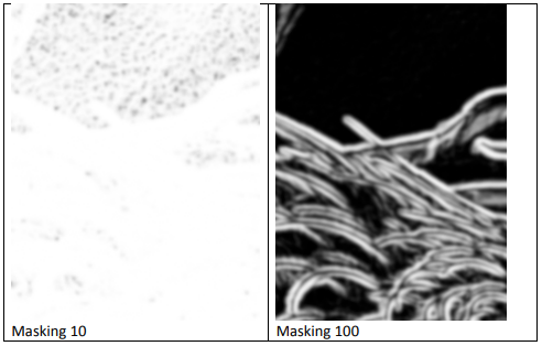
Masking. This control is almost the opposite of the detail slider. Increasing the masking will eliminate sharpening on larger areas of similar pixels. At 0 there is no masking. At 100 only the most “edgy” areas (areas with obvious edges) will be sharpened. That is, areas with lower contrast/fewer edges will be masked from the sharpening filter. Hold down ALT / OPTION and move the masking slider to see the areas affected. In the figure below, white = full sharpening, black = no sharpening; grey = partial sharpening. By masking 100 only the most obvious edges will be sharpened.

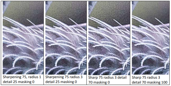
Here are a few variations… first increase sharpening to 75. Notice the increased grain in the background area, not so evident in the area where there is feather detail. Increasing radius to 3 (2nd panel) markedly increases the graininess, and the detail in the feathers is lost. Moving the detail slider up to 70 further increases the graininess of the background, but restores some detail in the feathers. Sliding masking up to 100 removes much of the background graininess, whilst retaining some detail in the feathers.

None of these settings is ideal, but the series demonstrates some of the effects of the different sliders. Have a play with your own images and explore the effects in various combinations. For this image I found sharpening 70, radius 1, detail 40 and masking 45 gave a reasonable compromise.
Note that with the sharpening filters interact with the noise reduction filters, and also with the clarity setting so by using these in combination there endless permutations of settings, some of which may bring improvement to your image. Note also that the local adjustment tools – brush, gradient and radial filter all allow local application of sharpness and noise reduction, though these come with more limited controls -a single slider each.